
(Welsh word of the post: ymchwilio, to research or investigate)
In the summer of 2016, I was at Woodbrooke as an Eva Koch scholar to research afterwords. This year’s scholars are coming to the end of their projects – or at least their time at Woodbrooke! – and I’ve just been corresponding with one of last year’s scholars. It seems like a good time to let you know what’s happened with my project since 2016: especially how I’ve shared my results and some new insights which have developed.
Publications
- An essay appeared in Quaker Voices in late 2016 – I’ve now republished this on my blog as old copies can be hard to track down. It has also been posted as a PDF by Quakers in Britain.
- A longer article appeared in Friends Quarterly in February 2017 – also now republished on my blog.
- An academic article appeared in Quaker Studies in early 2018 – this is open access so the link goes to the journal itself.
- There are also my blog posts made at the time – these can be found by scrolling back through the ‘afterwords’ tag.
Events
As well as presenting short sessions about afterwords and answering emails and telephone calls, I’ve run two formal events on this theme.
- One was a course at Swarthmoor Hall, called ‘Worship, Ministry, and Afterwords’. A weekend course with a small group is a chance to dig into a topic in some depth, and we talked about the uses of silence, the many structures of ‘afterwords’, different understandings of spoken ministry, and many other things.
- One was a Woodbrooke on the Road, requested by a local meeting to help them review their own use of afterwords. The Sunday afternoon session generated lots of interest and discussion – and could still be booked by other meetings who want to explore this topic.
New insights
In looking for ways to present my ideas to new audiences, one of the things I did was to try and turn my key points into diagrams. This doesn’t come very naturally to me, but when I make the effort it’s often very helpful to me as well as whoever I’m explaining to!
In this case, I made two sets of diagrams. One is a linear diagram which shows meeting for worship (the straight line), notices (a zig-zag line), afterwords (a wiggling line), and refreshments (a dotted line), all heading down the page as time passes. Here’s a version I drew for a course group.

Worship and afterwords – start at the top, and more time passes as you go down the page.
Each of the five coloured lines represents a different pattern for worship and afterwords. The blue one is what I grew up thinking of as ‘normal’: meeting for worship lasts an hour, it ends (with handshakes), there are notices, then refreshments. The green one shows afterwords as ‘bridging time’ – between meeting for worship and notices there is an in-between time, when we can adjust to the rules changing. The lines make it very clear why this model is not favoured by people who are ready for their coffee after an hour of worship!
The third line, the orange one, shows afterword happening towards the end of, but during, meeting for worship – as happens in meetings where it is more like ‘respectful listening’. Here, the rules of worship are adjusted into those of afterword but without formally ending meeting for worship – and, typically, sooner than meeting for worship would usually finish. The fourth line, in red, then shows other ways to order these elements. For example, some meetings have third items after the handshake and before refreshments: afterwords, joys and concerns, and notices. Depending on how they are each understood, these can be ordered differently and the guidelines for speaking in them may be more or less strict.
Finally, the black line shows afterwords moved to after the notices. This gives it a different feel – and, as the diagram suggests, usually gives people a way to opt out, to stay having refreshments and chatting rather than going into afterwords. (Options can be introduced in the other patterns in some cases: meetings with a separate room for refreshments can let people slip out even when afterwords is held directly after meeting for worship.)
Another set of diagrams tried to think through the ways in which ordinary speech, spoken ministry, and contributions to afterwords are related to one another. Here are all three drawn up on a flipchart – below this picture, I’ve re-drawn them digitally to make them easier to see, and I’ll talk about them one at a time.

Diagrams on a flipchart.
The first diagram is set of three columns, each filled with two colours.

Comparing spoken ministry, ordinary speech, and afterwords
The three columns each represent a different kind of speech – spoken ministry, ordinary speech, and contributions to afterwords. The idea of this diagram is to try and get at the ways that different sources are understood to inform different kinds of speech. In traditional Quaker language, spoken ministry comes ‘through us, not from us’, because it is seen as a message from God. I didn’t want to make assumptions here about the internal or external reality of the Divine, but I did want to get at the idea that ministry is not just us saying whatever we like. I chose the terms ‘ego’ and ‘inspiration’ to try and make that distinction – ‘ego’ is from me, maybe not just from my ego in the Freudian sense, but what I choose to say and from my perspective. ‘Inspiration’ is from beyond or other than me, wherever you understand that to be located.
The rending of each column into quarters is a rough estimate – just enough to make a comparison, since I wouldn’t want to claim that these things are measurable! The ‘ministry’ column is three-quarters inspiration and one-quarter ego: this tries to represent my own experience of giving spoken ministry, that I have a role to play it in and my knowledge and experiences feed it, but it is not mostly my own. The ‘ordinary speech’ column is three-quarters ego and one-quarter inspiration: sometimes in the most mundane conversations someone says something which is so insightful or revealing that it seems to contain that of God, but this isn’t the majority of the time. The last column, for afterwords, is half ego and half inspiration. That tries to reflect the shifting balance respondents in my survey reported, that contributions to afterwords can contain more of the speaker’s personal stuff than is acceptable in ministry, but also that afterwords are more likely to be channels for the Light than things said in ordinary conversation.
The second diagram is a Venn diagram which again tries to show how afterwords might relate to other forms of speech. To be honest, I think this is the least successful of the three.

Venn diagram of communication, speech, ministry, and afterwords
There are four ovals in this diagram. The black one represents ‘all communication’ and is largest. The red one represents ‘all speech’ – the majority of it is inside the black oval, although I left a little outside to represent speech which fails to communicate (perhaps by accident, like when I try to say something in a language I’m learning and my pronunciation or grammar is so atrocious nothing gets across, or on purpose, as when I say something out loud to an empty room in the hope that I will then not say something regrettable on Twitter).
The next largest oval is a green one for ‘spoken ministry’. I have put this entirely inside both ‘speech’ and ‘communication’. Spoken ministry is speech by definition, although of course things other than speech can certainly be ministry. I think it is also communication every time, even though it might sometimes fail ordinary tests of communication – if I am inspired to stand in meeting for worship and say something in such garbled Welsh that it’s incomprehensible, something about that is still God’s message even if it isn’t what I think I’m trying to say!
I’ve then drawn a small blue circle for afterwords, half in the ‘spoken ministry’ oval and half outside. Actually, I think some contributions to afterwords could fail to communicate in some of the ways speech can – although perhaps the act of trying to speak during afterwords succeeds in communicating something, even if it isn’t the message as intended.
The final diagram shows a testing net, with ministry, ordinary speech, and afterwords as stones or balls of various sizes.
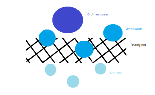
A ‘testing net’ image for speech, afterwords, and ministry.
In this version of the diagram, I’ve made the three sizes of circle three different shades of blue to suggest why we need a testing net – they have lots of similarities, and can be difficult to tell apart. The testing net is made up from whatever tests you use when deciding whether or not to speak during meeting for worship: typically, questions like “is this message just for me, or for the whole meeting?” and “am I so strongly led to speak that I can’t NOT speak?” form part of this process. Ordinary speech, represented here by the dark blue circle, is too large to go through the grid – it gets stopped by the testing net. Spoken ministry, here some small, light blue circles, can go through easily. Some circles are just about the same size as the holes, and they might or might not get through… so they form the is-it-or-isn’t-it category of ‘afterwords’.
When I’ve tried these diagrams out in workshops, so far this last one seems to be the most successful in creating useful discussion. It can be a diagram, but could easily be made into a 3D, tactile model – I could imagine using ordinary household items (colander, sugar, peas?) to start a discussion about this with an all-age group.

Thank you Rhiannon, I think this helps to explain why afterwords ends up so complex and controversial.